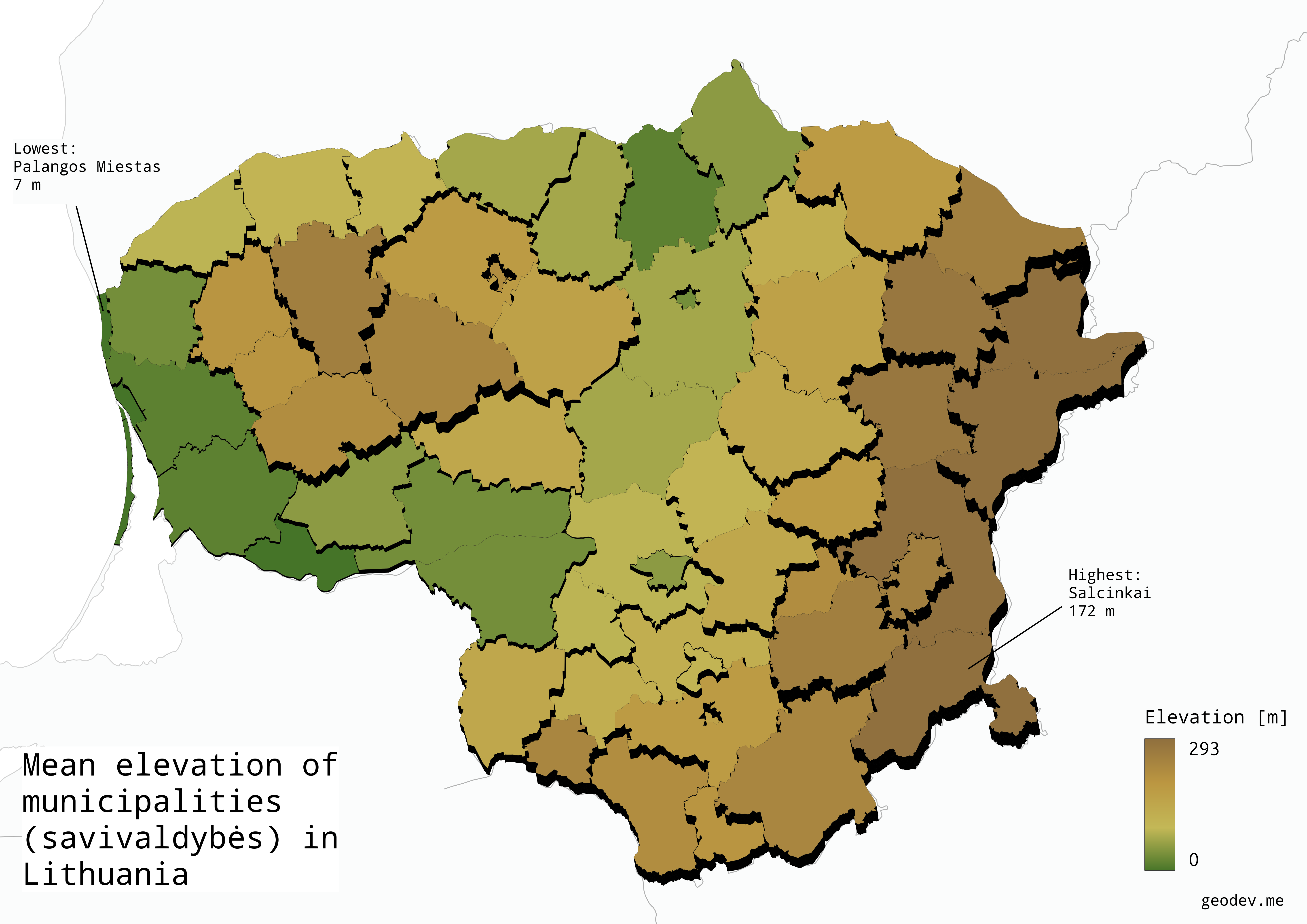
The Zonal Statistics is one of a many processing algorithms available in QGIS. It’s simple and powerful feature that allows to calculate statistics for raster datasets based on zones defined by vector polygons. Recently I’ve made a map using this technique to depict the mean elevation of each municipality (savivaldybės) in Lithuania.

First, we need a raster with elevation data. I suggest to use SRTM (30m resolution) which is available for free. You can get the raster data by downloading them manually from the dwtkns.com website. Other good source is USGS where you can find a lot of other useuful data for free. The only downside is a bit outdated and convoluted UX for searching the datasets you want. Another option I can suggest is using QGIS plugin - OpenTopography Dem Downloader. You can download the geotiff’s directly in QGIS for a selected area.
If you downloaded multiple rasters it’s better to merge them to work with one single one. You can do it choosing the option “Merge” from Raster -> Miscellaneous. Next, we need polygons on the basis of which the average raster value will be calculated. IF you want to do it for administrative regions you can download them from simplemaps.com. That’s just one example. GIS data for such common information like administrative regions should be easily available from other sources too.
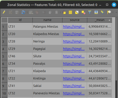
Once we have both layers ready - the raster and the polygon layer, we can proceed to the analysis. In the Processing Toolbox toolbar find Zonal statistics. If you don’t see this toolbar in your QGIS you can add it to the view choosing View -> Panels -> Processing Toolbox. Also you can find this option from the searchbar at the bottom (or using shortcut CTRL/CMD + K). Zonal Statistics tool is very simple to use. Just select the input layer (your polygon layer) and raster layer. You can select the statistics to calculate, I’ve chosen only the mean value. Hit run and let the algorithm do the work. The new temporary vector layer with polygons will be created and added to the project. If you check the table you will notice that a new column with the calculated data is added to the layer.

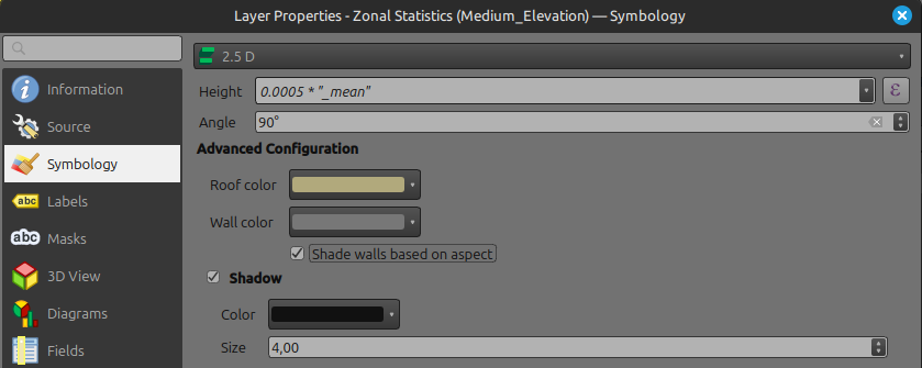
That’s basically it. You have a polygon with calculated data. But I want to also show how to style this layer using 2.5D technique. In the layer options choose Symbology -> 2.5D. Depending of your raster extent - set the Height value as an expression which should be calculated basing on the column with a mean elevation value. In my scenario the elevation values are quite low (because Lithuania is mostly flat country) so my factor to calculate the height of polygons is low:

Also - turn of the shadow option. Won’t be needed and causes a lot of additional resources to be calculated.
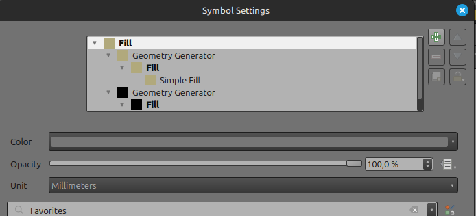
When you set the 2.5D option, choose the Graduated symbology and in the Value section choose the column with the mean elevation data. To create a ramp with values I used Equal Count mode and added quite a lot classes. For me 17 classes seemed to be optimal. More adjustments to the appearance might be done we check the Symbol Settings. Double-click on Symbol in the Layer properties. This window will show up:

Double click the Geometry Generator option. Click the expression builder icon to show the expression. Here is my value in that box after adding the height factor right after the qgis_25d_height part:
order_parts( extrude( segments_to_lines( $geometry ), cos( radians( eval( @qgis_25d_angle ) ) ) * eval( @qgis_25d_height ) * 0.5, sin( radians( eval( @qgis_25d_angle ) ) ) * eval( @qgis_25d_height ) * 0.5 ), 'distance( $geometry, translate( @map_extent_center, 1000 * @map_extent_width * cos( radians( @qgis_25d_angle + 180 ) ), 1000 * @map_extent_width * sin( radians( @qgis_25d_angle + 180 ) ) ))', False)To make it consistent you have to change for both Geometry Generator layers.
I’ve added 0.5 because this value fits for my dataset. In your case, other values might be better. One more thing we can do is to adjust the color of the “walls” of the 2.5D. In my case the simple black looks good. To change it double click “Simple Fill” under the Geometry Generator. In the Fill color section change it to black.
After completing these steps, your polygons should look similar to what I presented at the beginning of this post. Of course, this is not a perfect effect. Applying 2.5D styling in QGIS can cause the illusion that some polygons have higher values than surrounding ones (which actually have lower values). QGIS gives you many possibilities for styling and obtaining interesting effects for presenting our work with spatial data. This is my first attempt at presenting data this way. I hope that future maps using this technique will be better.