Zen mode is a popular UX pattern that creates a distraction-free experience for application users. It’s a simple approach where part of application interface is hidden on user’s demand. I have encountered this mode in applications where the main functions are based on focus and tranquility. One of them is Lichess, the second chess platform in the World. I am a chess enthusiast and I am trying (with poor results) to develop my skills in this direction. If you’re a chess enthusiast too, feel free to challenge me to a game. Lichess has a Zen mode, and I thought I’d write a post about how you can implement it in your own React app.
Setup
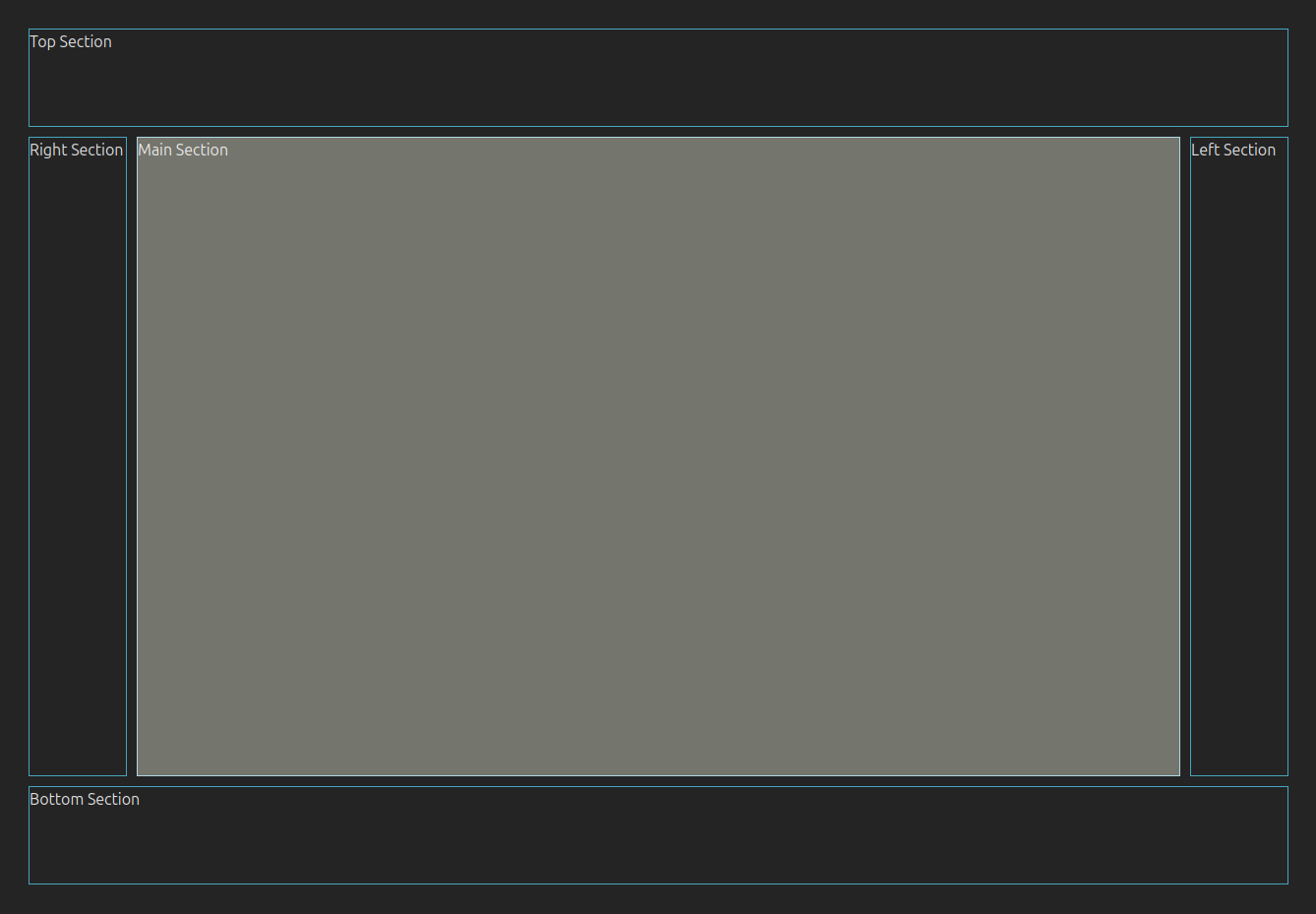
First we need a markup to create our layout. I’ve decided to copy some of the Lichess approach which is close to the Holy Grail. If you don’t know what a Holy Grail in web design is, start with Wikipedia. Here’s how it looks like in my example:

To achieve this I used css grid.
import './App.css'

function App() {
  return (
    <div className="container">
      <div className="box top">Top Section</div>
      <div className="box right">Right Section</div>
      <div className="box main">Main Section</div>
      <div className="box left">Left Section</div>
      <div className="box bottom">Bottom Section</div>
    </div>
  )
}

export default App
And below is the css portion of this design (App.css).
.box {
  border: 1px solid #47a5bd;
}

.container {
  display: grid;
  grid-template-columns: 100px 1fr 100px;
  grid-template-rows: auto 1fr auto;
  grid-template-areas:
  "top top top"
  "right main left"
  "bottom bottom bottom";
  gap: 10px;
  height: 100%;
}

.top {
  grid-column: 1 / span 3;
  grid-row: 1;
  height: 100px;
  grid-area: top;
}

.right {
  grid-column: 3;
  grid-row: 2;
  grid-area: right;
}

.left {
  grid-column: 1;
  grid-row: 2;
  grid-area: left;
}

.main {
  grid-column: 2;
  grid-row: 2;
  grid-area: main;
  border: 1px solid lightblue;
  background-color: #74756d;
}

.bottom {
  grid-column: 1 / span 3;
  grid-row: 3;
  height: 100px;
  grid-area: bottom;
}
In this example, enabling zen mode will hide all containers except the center one with the class “main”.
User interaction
To turn on the Zen Mode we need a interaction handler. I decided to turn this feature on/off with the “Z” key. To handle this I created a hook which can be reused in any other components in the application.
import { useCallback, useEffect } from "react";

export const useKeyboardShortcut = (keyShortcut: string, callback: (event: KeyboardEvent) => void) => {

  const handleKeydown = useCallback((event: KeyboardEvent) => {
    if (keyShortcut === event.key) {
      callback(event)
    }
  }, [keyShortcut, callback]);

  useEffect(() => {
    window.addEventListener('keydown', handleKeydown);

    return () => {
      window.removeEventListener('keydown', handleKeydown);
    }
  }, [handleKeydown]);
}
I deliberately left this hook very simple. It can take a single key as an argument and callback to trigger after the key is pressed. In modern web applications you can use many more complex keyboard shortcuts, but that is beyond the scope of this article. All we need here is to listen for a keydown event and react to it. Next, we have to use this hook in App.tsx.
import './App.css'

function App() {
  useKeyboardShortcut('z', () => console.log('Callback'));

  return (
    <div className="container">
      <div className="box top">Top Section</div>
      <div className="box right">Right Section</div>
      <div className="box main">Main Section</div>
      <div className="box left>Left Section</div>
      <div className="box bottom">Bottom Section</div>
    </div>
  )
}

export default App
We have to pass a callback function that will trigger on the ‘z’ key. For now put just console.log and check if there’s log in the browser’s console if you press ‘z’ key.
Store the zen mode state
There are a few methods of storing the state of the user’s UI. Lichess stores this information in the database, so there’s a request made if user toggles this option. I decided to store this information in the browser. I think that zen mode is a temporary option and there is no need to make a request to the backend. I also chose this option because my demo application does not have a backend ;-). So in this example I will show how to store the information in the URL. Furthermore, maintaining application state in the URL is a popular method in React apps.
To do it I created another hook. It gets the search parameters from the URL and handles the changes. To demonstrate the underlying mechanics, I opted not to use react-router in this example. Besides I achieved this by using URLSearchParams interface from Web API.
I know that react-router is a standard library to support this type of operations. I believe that sometimes it is worth taking a step back and checking how to use the basic tools provided by the browser API.
import { useEffect, useState } from "react"

export const useUrlParams = () => {
  const [params, setParams] = useState<URLSearchParams>();

  const handleUpdateUrl = (params?: URLSearchParams) => {
    if (typeof window === 'undefined') return

    const newParams = new URLSearchParams(params?.toString());
    const queryString = newParams?.toString();
    const newUrl = queryString ? `${window.location.pathname}?${params?.toString()}` : window.location.pathname;
    window.history.replaceState(null, "", newUrl);
    setParams(newParams);
  }

  useEffect(() => {
    if (typeof window !== 'undefined') {
      const searchParams = new URLSearchParams(window.location.search)
      setParams(searchParams)
    }
  }, [])

  return {
    params,
    handleUpdateUrl,
  }
}
useUrlParams hook synchronizes the URL’s search parameters with the component’s state and provides a utility function for updating the URL programmatically. It returns two values:
params: The current URLSearchParams object, representing the query parameters,handleUpdateUrl: A function to modify the URL’s query parameters.
To make this hook useful we need another hook (the last one) for toggling the zen mode.
Toggle the zen mode
The useZenMode hook is a react hook designed to manage a Zen Mode state using URL query parameters. It builds upon the useUrlParams hook to dynamically toggle and reflect the Zen Mode state in the browser’s URL. If you want to store this information in other way (localStorage, sessionStorage, etc.), you have to change the handleSwitchZenMode function implementation.
import { useUrlParams } from "./useUrlParams";

export const useZenMode = (paramName = 'zenMode') => {
  const {params, handleUpdateUrl} = useUrlParams();
  const zenMode = params?.get(paramName) === "true" || false;

  const handleSwitchZenMode = () => {
    const newMode = !zenMode;
    if (newMode) {
      params?.set(paramName, newMode.toString());
    } else {
      params?.delete(paramName);
    }
    handleUpdateUrl(params);
  }

  return {
    zenMode,
    handleSwitchZenMode
  }
}
The last part is to join the hooks together in the main component.
Conclusion
Here’s the final version of the App.tsx component that combines useZenMode and useKeyboardShortcut hooks. Also I’ve added conditional css classes to reflect the changes in the UI.
import './App.css'
import { useKeyboardShortcut } from './hooks/useKeyboardShortcut'
import { useZenMode } from './hooks/useZenMode';

function App() {
  const {zenMode, handleSwitchZenMode} = useZenMode();
  useKeyboardShortcut('z', handleSwitchZenMode);

  return (
    <div className="container">
      <div className={`box top ${zenMode ? 'hidden' : ''}`} aria-hidden={zenMode}>Top Section</div>
      <div className={`box right ${zenMode ? 'hidden' : ''}`} aria-hidden={zenMode}>Right Section</div>
      <div className="box main">Main Section</div>
      <div className={`box left ${zenMode ? 'hidden' : ''}`} aria-hidden={zenMode}>Left Section</div>
      <div className={`box bottom  ${zenMode ? 'hidden' : ''}`} aria-hidden={zenMode}>Bottom Section</div>
    </div>
  )
}

export default App
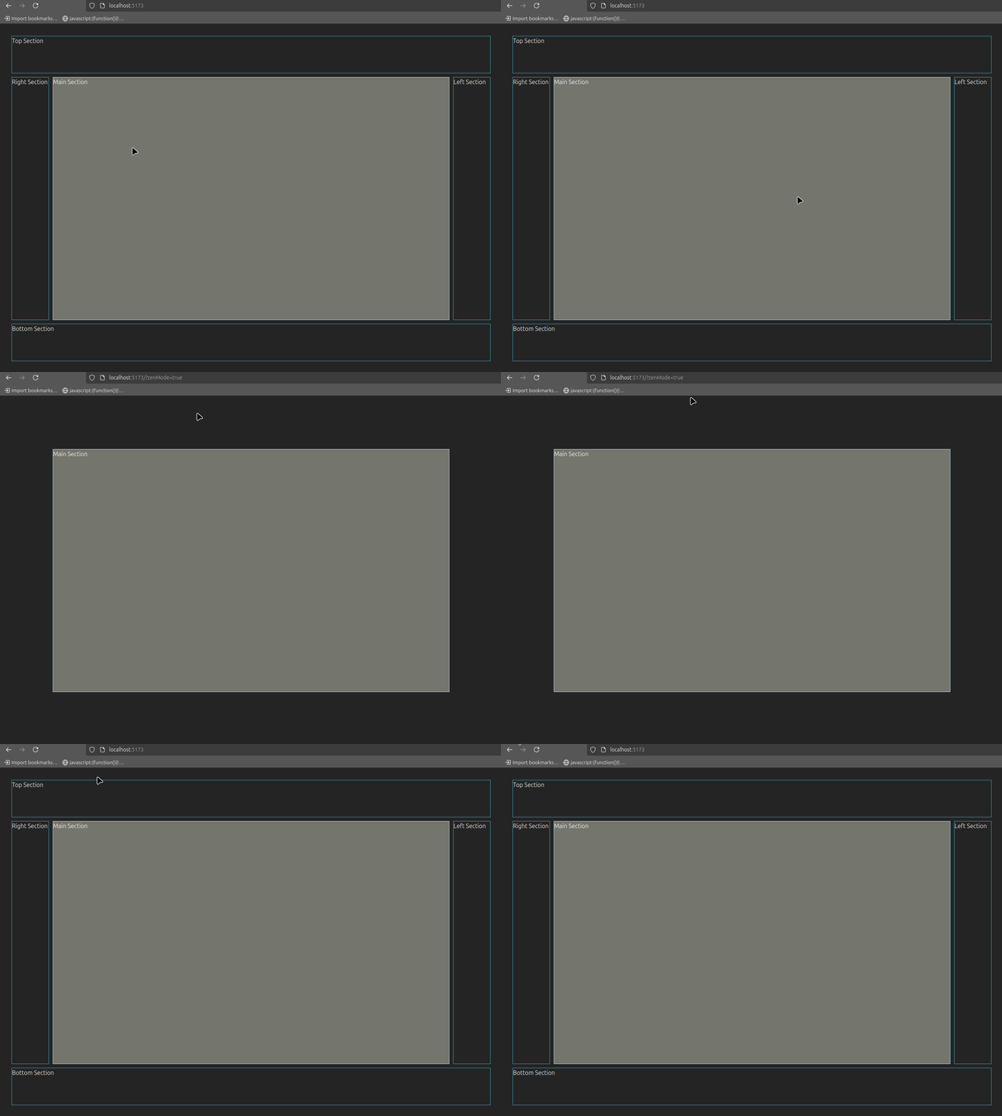
I added css classes to all containers that I want to hide with zen mode. The class hidden changes the visibility property from unset to hidden. I’ve chosen this option to prevent the layout shifting which might occur if you use display: none.
.hidden {
  visibility: hidden;
}
Finally, here’s how it looks like in action.
