A common component we see in applications is a component that displays progress, progress. This can be:
- downloading files,
- package usage,
- data loading,
- remaining subscription period.
In this, of course, you can use one of the many available solutions that you will find in the NPM repository. As always in such cases, I suggest making such a component yourself. In addition to the undoubted educational advantages, we have full access to the component and the freedom to extend and modify it.
In this component I use svg instead of div. Why? In my opinion for interactive components we have more control over the elements while using svg elements. We can easily create elements such as circles, arcs, curves. It is also faster and lighter for the browser than rendering HTML tags.
Here’s the whole component:
import React, { ReactNode } from 'react';

interface CircularProgressConfig {
  filledColor: string;
  availableColor: string;
  size: number;
  strokeWidth: number;
  outerLineStrokeWidth: number;
}

interface CircularProgressProps {
  config?: Partial<CircularProgressConfig>;
  total: number;
  usedValue: number;
  insideText?: string | ReactNode;
}

const defaultConfig: CircularProgressConfig = {
  size: 130,
  filledColor: '#88D66C',
  availableColor: '#758694',
  strokeWidth: 10,
  outerLineStrokeWidth: 5,
};

const clamp = (value: number, min = 0, max: number) =>
  Math.min(Math.max(value, min), max);

const calculatePercent = (used: number, total: number) =>
  clamp((used / total) * 100, 0, 100);

const renderCircle = (
  config: CircularProgressConfig,
  radius: number,
  color: string,
  dashArray?: string,
  dashOffset?: number
) => (
  <circle
    stroke={color}
    fill="transparent"
    strokeWidth={config.strokeWidth}
    strokeDasharray={dashArray}
    strokeDashoffset={dashOffset}
    r={radius}
    cx={config.size / 2}
    cy={config.size / 2}
    transform={
      dashOffset
        ? `rotate(-90 ${config.size / 2} ${config.size / 2})``
        : undefined
    }
  />
);

export const CircularProgress = ({
  config = defaultConfig,
  total,
  usedValue,
  insideText,
}: CircularProgressProps) => {
  const mergedConfig = { ...defaultConfig, ...config };
  const { size, filledColor, availableColor, outerLineStrokeWidth } =
    mergedConfig;

  const radius = (size - 10) / 2 - outerLineStrokeWidth;
  const circumference = radius * 2 * Math.PI;
  const percent = calculatePercent(usedValue, total);
  const offset = circumference * (1 - percent / 100);

  return (
    <div
      className={`circular-progress`}
      style={{'--size': `${size}px` } as React.CSSProperties}
    >
      <svg width={size} height={size}>
        {renderCircle(mergedConfig, radius, availableColor)}
        {renderCircle(
          mergedConfig,
          radius,
          filledColor,
          `${circumference} ${circumference}`,
          offset
        )}
      </svg>
      <div className="inside-text">{insideText}</div>
    </div>
  );
};
Let’s explain some parts of the code.
interface CircularProgressConfig {
  filledColor: string;
  availableColor: string;
  size: number;
  strokeWidth: number;
  outerLineStrokeWidth: number;
}

interface CircularProgressProps {
  config?: Partial<CircularProgressConfig>;
  total: number;
  usedValue: number;
  insideText?: string | ReactNode;
}

const defaultConfig: CircularProgressConfig = {
  size: 130,
  filledColor: '#88D66C',
  availableColor: '#606676',
  strokeWidth: 10,
  outerLineStrokeWidth: 5,
};
First I declare props for the component itself and the circle config. I set the default values for the configuration. Of course it’s possible to overwrite the default config. Just pass the config prop while using CircularProgress component.
const clamp = (value: number, min = 0, max: number) =>
  Math.min(Math.max(value, min), max);

const calculatePercent = (used: number, total: number) =>
  clamp((used / total) * 100, 0, 100);
These two utility functions could be omitted, since we use it once in this component. But I like to separate concerns and split the code into reusable parts. The clamp function takes the minimum, maximum and actual values to prevent the situation where there’s a value that’s not inside the valid range. For example if you want to show values from 0 to 100 and you accidentally pass a value outside of this range (like -5 or 104, because that’s what you get from backend probably) this function will guard this condition.
const renderCircle = (
  config: CircularProgressConfig,
  radius: number,
  color: string,
  dashArray?: string,
  dashOffset?: number
) => (
  <circle
    stroke={color}
    fill="transparent"
    strokeWidth={config.strokeWidth}
    strokeDasharray={dashArray}
    strokeDashoffset={dashOffset}
    r={radius}
    cx={config.size / 2}
    cy={config.size / 2}
    transform={
      dashOffset
        ? `rotate(-90 ${config.size / 2} ${config.size / 2})`
        : undefined
    }
  />
);
That’s the function that takes some props and returns the circle svg element. We will use this function twice to generate two elements of the component.
const radius = (size - 10) / 2 - outerLineStrokeWidth;
const circumference = radius * 2 * Math.PI;
const percent = calculatePercent(usedValue, total);
const offset = circumference * (1 - percent / 100);
Here are the constants inside the component. They just get the values for radius and other data needed to render the svg correctly.
Don’t forget about the styles. Note that I used css variables here.
.circular-progress {
  position: relative;
  display: flex;
  align-items: center;
  justify-content: center;
  width: var(--size);
  height: var(--size);
}

.inside-text {
  position: absolute;
  width: 75%;
  font-size: 0.75rem;
  text-align: center;
}
And the final part shows how you can use the component.
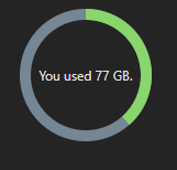
function App() {
  const usageValues = {
    total: 200,
    used: 77,
  };

  return (
    <div>
      <CircularProgress
        total={usageValues.total}
        usedValue={usageValues.used}
	insideText={`You used ${usageValues.used} GB.`}
      />
    </div>
  );
}
That’s our final result in the app.